Brand Identity
3D
UX/UI
ITF Group
ITF Group is an established logistics company with serious presence in its industry — the kind of business whose brand carries years of accumulated trust. A sharper-looking competitor had raised the bar on how a modern logistics brand should look, and next to it ITF's identity was starting to feel dated. My team was brought in to modernise how ITF looked and felt, without spending the recognition the brand had already earned.
Industry
Logistics
Year
2024
Role
Project lead (Team of 3)
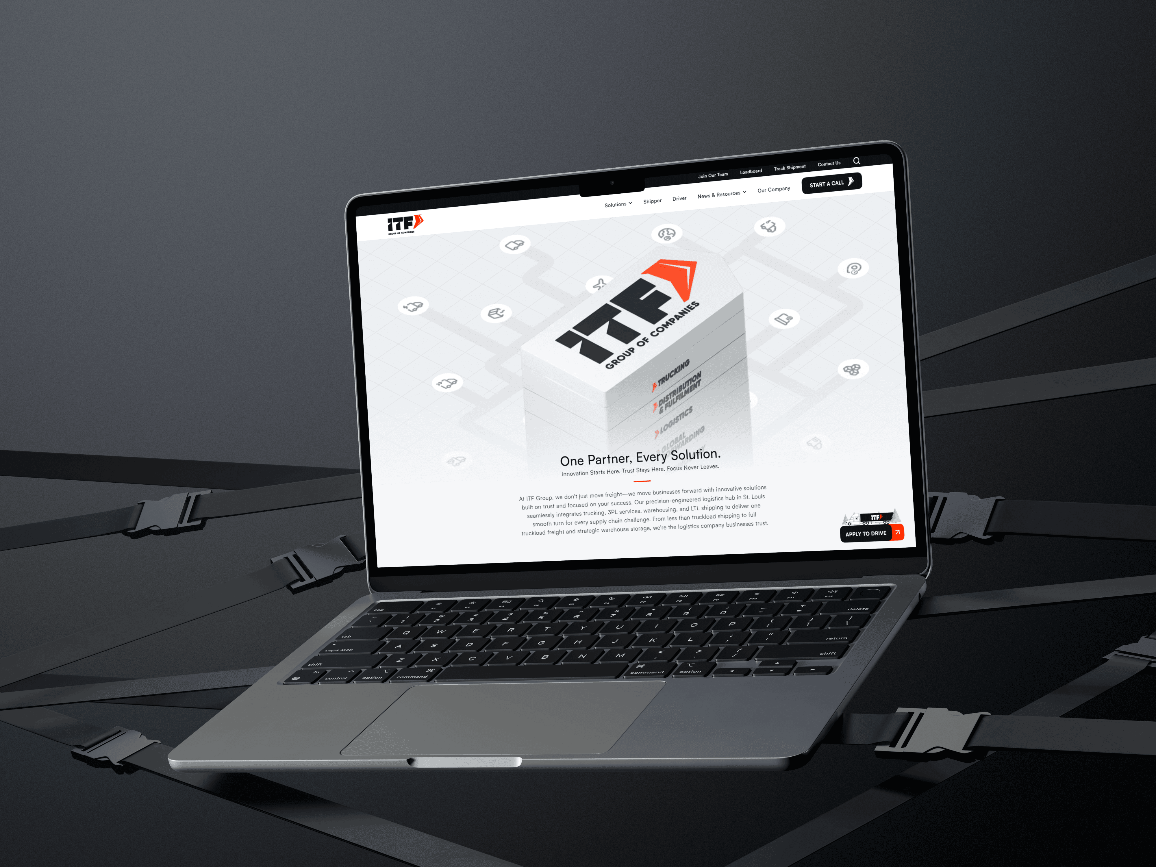
A clean-slate rebrand was the wrong move. Throw out the existing identity and you signal reinvention to a market that trusted ITF because it was established. The real brief was harder than "make it look modern": sharpen the brand to stand confidently next to a slicker competitor, while keeping enough of the original that existing clients still recognised exactly who they were dealing with. A second constraint shaped the system: the identity had to sit within a wider family of companies — so it needed to read as part of a group, not just as a standalone mark.
As project lead, I set the direction and made the keep-versus-change calls, with two designers executing alongside me. The guiding principle was continuity with more confidence — evolve the brand, don't replace it. Kept the equity, sharpened the mark. I retained ITF's existing logo mark rather than starting over, so recognition carried forward. But I rebuilt it with tighter geometric precision and a subtle sense of motion — same identity, more deliberate, more agile. Modernised the typography. The old wordmark read dated next to the competitor. I moved to a stronger, more contemporary typeface that matches the group's scale and standing in the industry — type that looks like it belongs to a company this size. Enriched the colour, kept it ITF. Orange was non-negotiable equity, so I kept it — but saturated and enriched it so the brand felt alive and current rather than washed out. Recognisably the same brand, visibly more energetic.


The new identity was adopted and published, and it's the identity ITF uses today — across their live site and public-facing touchpoints, including industry expos where the refreshed brand does the work of representing the group in the room. The clearest measure of success here isn't a metric; it's that the client took the system into the world and it's still carrying the brand.
