Brand Systems
3D
UX/UI
Indicor
Indicor is a group of 13 companies operating across 10 different industries. The challenge wasn't branding one company — it was making thirteen of them feel like one, without erasing what made each distinct. The brand had to speak to three audiences at once: clients evaluating the companies, acquisition targets sizing up the group, and the internal teams inside it.
Industry
Enterprise group
Year
2024
Role
Visual lead (Team of 3)

Thirteen companies, ten industries, three audiences — and one requirement pulling against all of them: coherence. Brand each company on its own and the group fragments into thirteen unrelated logos. Over-standardise, and you flatten thirteen real businesses into a monolith that speaks to none of their markets. The real problem was architecture: a single system flexible enough to let each company stay itself, disciplined enough that they unmistakably belong to the same group. It also had to hold at the detail level — each company needed its own branded mini-page that felt individual while still reading as part of the whole.
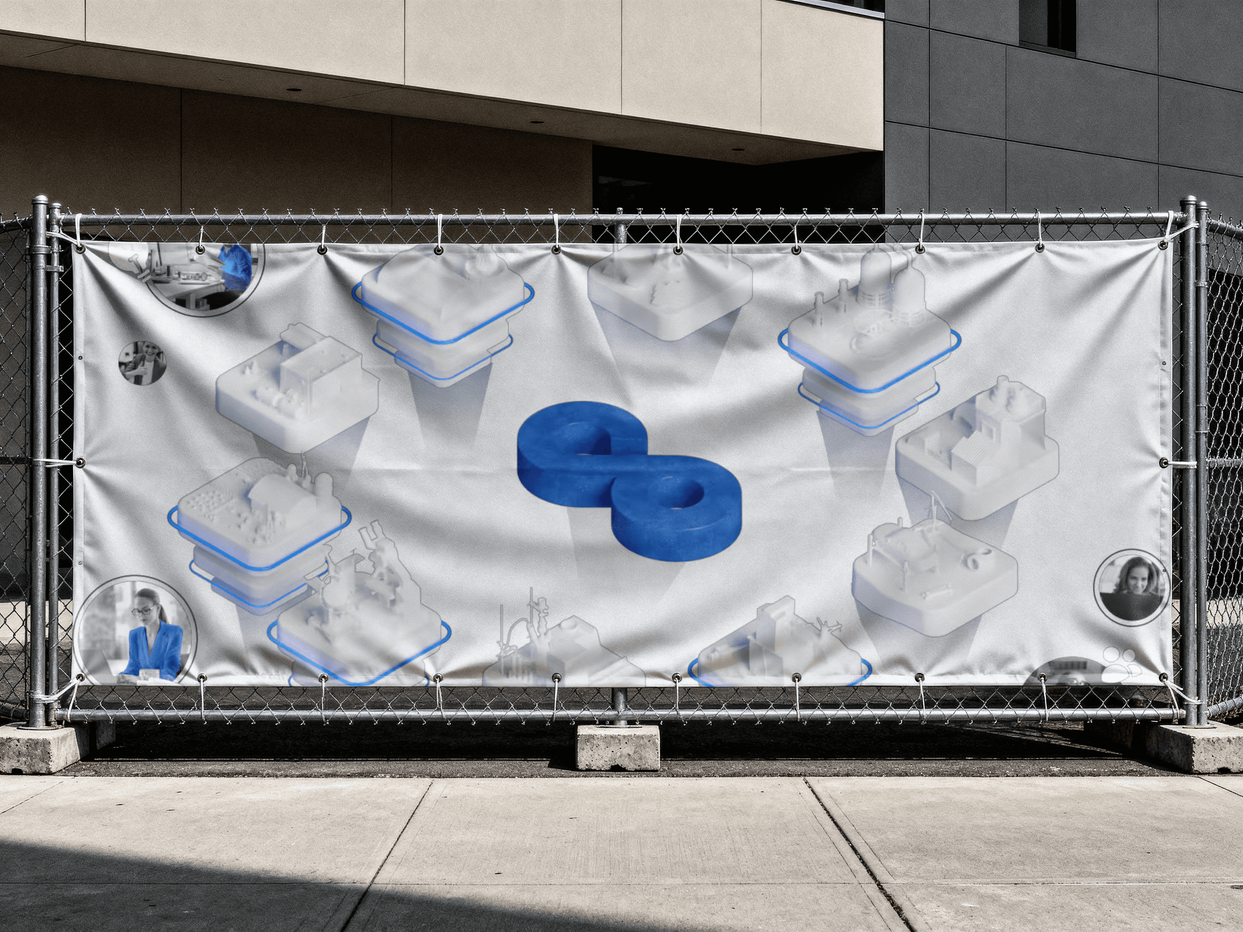
I worked in a 3-person team. My ownership was two-fold: the visual and 3D execution that gave the system its look, and the brand-bridging — the connective logic that let 13 identities hold together as one. We built the whole thing on one deliberately simple guideline: one Indicor style, each company's own colour, one unified 3D language. One skeleton, thirteen palettes. Every company inherited the same Indicor foundation and a single shared typeface — but kept its own colour palette as its identifier. The structure said "same group"; the colour said "still us." That split is what let one system carry thirteen distinct identities without fragmenting. 3D as the connective tissue. I reconstructed each company's products in a single unified Indicor 3D style. This was the quiet workhorse of the system — it meant companies in completely different industries still visually rhymed, because their products were rendered in the same visual language rather than thirteen mismatched styles. The micro-page as the bridge. Each company got a branded mini-page that acted as a middleman — handing the visitor from the group identity down into the individual company, so the transition felt continuous instead of like leaving one brand and landing on another.
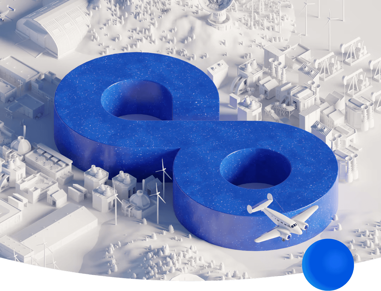


The system was adopted and is live across Indicor's group of companies today. The proof it holds isn't a single screen — it's that one set of rules successfully carries thirteen companies across ten industries while still reading as one group, which is precisely the coherence the brief demanded.