UI/UX
Research
Product Design
Energy Insight
Most people pay their electricity bill without ever knowing where the energy actually goes. Energy Insights is a platform that turns raw consumption data into something a person can read at a glance — so households and businesses can see what's costing them and act on it, rather than reacting to a bill at the end of the month.
Industry
Sustainability
Year
2024
Role
Sole designer — research, IA, UI
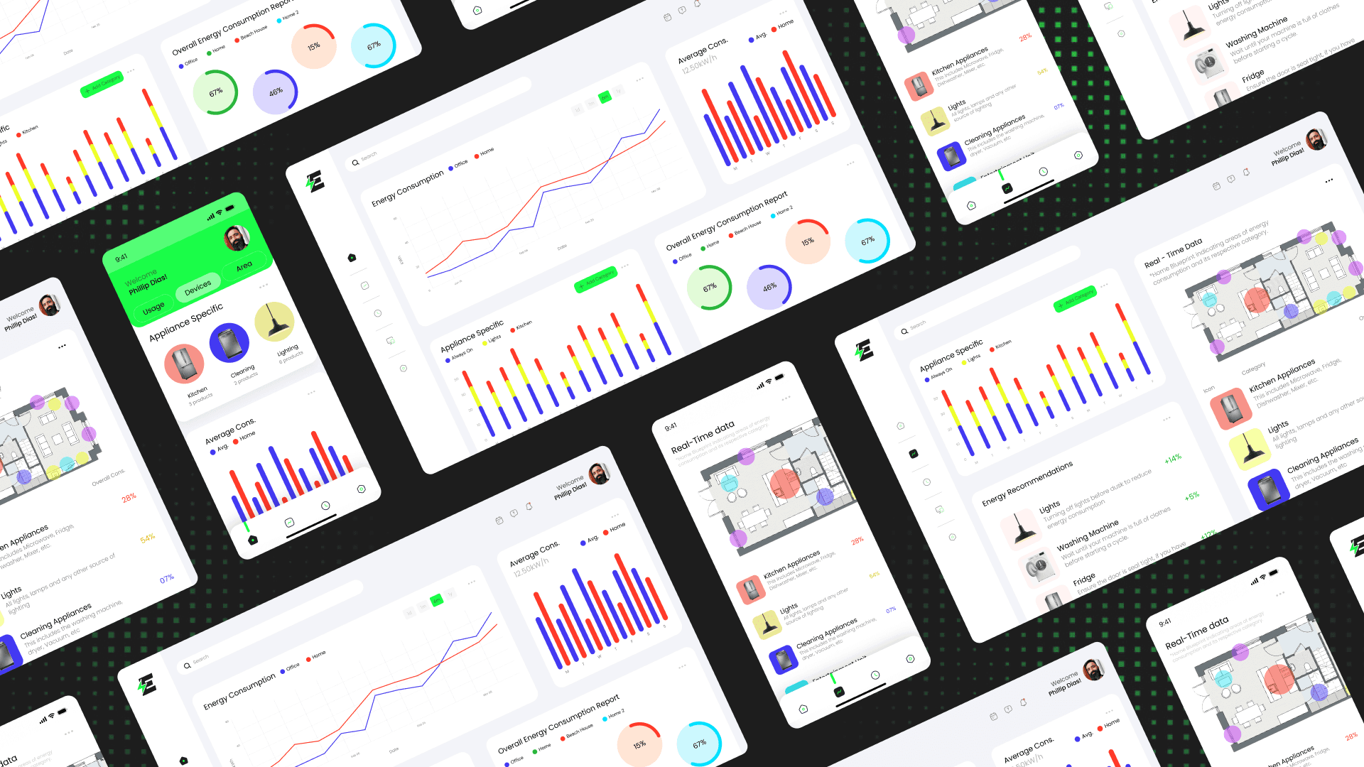
Energy tracking tools tend to serve one audience well and everyone else badly. Across a six-product teardown — Sense, Bidgely, Enel X, EnerWisely and others — one split kept repeating: products aimed at residents rarely scaled to businesses, and products built for commercial and industrial clients were too heavy for an ordinary household. Meanwhile the features people actually valued were consistent across both: real-time monitoring, appliance-level breakdowns, and clear, personalised recommendations. Research across four personas — a homeowner, a small-business owner, an environmental journalist, and a smart-home-savvy engineer — pointed the same way. Different lives, same underlying need: make consumption legible, in real time, in a way one person can act on — whether that's a family cutting a bill or a business reporting to an advisor.
I designed the platform around the shared need the research surfaced — legibility first — and let it flex across audiences rather than picking one. Visual before numeric. Consumption is shown as charts and breakdowns, not raw figures, because every persona said the same thing: they understand a picture faster than a number. Real-time and appliance-level. Usage updates live and breaks down by device, so a spike is visible as it happens and traceable to what caused it — the single most-valued feature across the competitive set. One platform, multiple lives. History and comparison for the household watching a bill; reporting for the business owner answering to an advisor; personalised recommendations for the user who wants to act, not just observe.


The result is a single visualization platform that closes the gap the market left open: legible enough for a household, structured enough for a business, without becoming two different products. The clearest signal it works is that its core move — turn live data into a picture, then into a recommendation — answers what every persona and nearly every competitor pointed to, in one coherent system.
